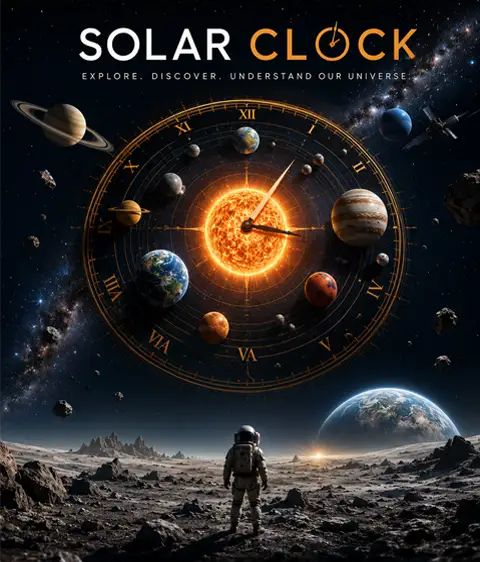





Solar Clock is built for a monitor. On phones, many of the animated HUD instrument panels are switched off so the layout stays readable - but every planet, moon, and this galaxy view are all still here to explore.
The planets and moons you see are placed live from published astronomical data - no positions are faked or pre-recorded. The few things that are illustrative rather than measured are called out below.
Whose review of this site was, generously and entirely, about scale - and made it more honest. The planet-size control now states its own exaggeration instead of calling itself “real”; the belts are marked as the broad regions they are rather than as lines; and every moon diagram now admits how far off its moon's size is, with a true-scale comparison beside it. Where a thing cannot be drawn truthfully, this site now says so out loud. That is her doing.
She then asked for one thing more: to be able to take hold of the solar system and look at it from another angle. That is why this map tilts and spins at all - and it turned out to answer her first note as well, because a view from the side can finally show what a flat overhead plate never could. Pluto really does ride 17° out of the plane; the belts really are thick. Solar Clock would like to convey incredible gratitude for her time and expertise.
Worth saying plainly, because this site is otherwise strict about it: the numbers are real, the artwork is not photography. Every position, distance, speed and date here is computed from published data. But the planet and moon discs, the surface views, the nebula backdrops behind each planet's system, and the Galaxy and Observable Universe scenes are illustrations generated for this site - not images returned by a spacecraft. They're guided by what these worlds are known to look like, and they're here to give each one a face rather than to document it, so no crater, cloud band or ridge in them should be taken as a real observed feature.
Three things on the site are real imagery, and they're marked where they appear: the night sky behind the map (a photograph - see below), the blueprint cards, which are rendered from NASA's published 3D models of the actual hardware, and the probe journey maps, which are plotted from real JPL ephemeris.
Every planet and dwarf planet is placed using the low-precision Keplerian orbital elements published by NASA / JPL (E. M. Standish, Keplerian Elements for Approximate Positions of the Major Planets), valid roughly 1800–2050. Each body's location is solved in real time from Kepler's equation (Newton's method) and projected into this heliocentric-ecliptic view - which you can tilt and spin to any angle, including edge-on and from below. Orbital inclination is real: each body's height above or below the plane of Earth's orbit comes from its own elements, which is why Pluto sits 17° out of the plane and Eris 44° once you look from the side.
Diameters, surface gravity, axial tilt, rotation periods, temperatures, atmospheric composition, discovery dates and moon rosters are drawn from NASA's Planetary Fact Sheets and JPL Solar System Dynamics. The surface-view instruments - temperature extremes, pressure, winds, surface composition and the highest-peak-to-deepest-valley elevation comparison - come from the same fact sheets plus published mission results. Where a value is genuinely unmeasured (for instance Nereid's terrain, which no spacecraft has resolved), the readout says so rather than inventing a figure.
Moon counts follow NASA's current tallies (Jupiter 101, Saturn 274, Uranus 28, Neptune 16, as of 2026). Each planet lists its explorable moons, then every other IAU-named moon, then a count of the small outer moons known only by provisional designations (like S/2023 S 1) - Saturn alone has hundreds. Names come from the IAU and NASA/JPL moon rosters.
Launch dates, agencies, milestones and mission facts come from NASA, ESA, JAXA and other mission pages. Their markers on the map and in the system views are illustrative, not tracked: landers sit at their real landing coordinates, but craft in flight or orbit are placed schematically.
The deep-space probe journey maps (the Voyagers, Pioneers, New Horizons, Cassini, Galileo, Juno, Ulysses, MESSENGER, Parker Solar Probe, Solar Orbiter, BepiColombo and Akatsuki) are the exception: those trajectories are real, computed from ephemeris drawn from NASA / JPL's Horizons system and replayed against the live clock, with each flyby marked at the encounter's true date. The Earth-orbit satellite cards, by contrast, show an illustrative ground track derived from each craft's real altitude and inclination - not live tracking.
The hardware on a craft's blueprint card is the real geometry: models published by NASA / JPL's 3D Resources library, which states plainly that "these assets are free and without copyright". It is rendered, not photographed - the hangar around it is a reconstruction rather than a picture of the real building, but each craft is set in the facility that genuinely built it: JPL for Cassini, Galileo and the Voyagers; Lockheed Martin in Denver for Juno and the Mars orbiters; Johns Hopkins APL for MESSENGER, Parker and STEREO; TRW in Redondo Beach for Chandra and Pioneer 10; Martin Marietta for Viking and Magellan; Dornier in Friedrichshafen for ESA's Ulysses; and ISAS / JAXA in Sagamihara for Hinode. Only craft NASA has published a model of can have one of these cards, which is why the ESA, JAXA and Soviet fleets don't yet.
Every word on the card is drawn live over the art rather than baked into it. Construction figures - prime contractor, build site, launch vehicle, mass breakdown, power and cost - come from agency mission records, and costs are given as spent, not adjusted for inflation. The callout labels point at real hardware, but a few are interpretive: where a model's parts could not be told apart with confidence, the label names the assembly rather than guessing at a specific instrument.
The first-person window on a probe's card is a reconstruction from the ephemeris, not photography. Where each planet, belt and star sits in it is computed from the same NASA / JPL Horizons trajectory the journey map uses, so the geometry is real - but no camera took the picture. Voyager 2's cameras were switched off in 1989 after Neptune to save power, and it has been blind ever since. The window shows roughly 70° of sky, and each craft's own instrument field is drawn to scale inside it - from Voyager's 0.42° narrow-angle camera, narrower than a full Moon, out to JunoCam's 58°. Ulysses gets no such box, because it carried no camera at all. Planets are drawn as instrument symbology rather than as luminous objects, because at these ranges they genuinely aren't visible - from 143 AU, Earth is around 15th magnitude. Only the Sun is given a real glow, because at magnitude −16 it really is still the brightest thing in that sky.
Under the window is the mission log, and every entry on it is a real dated event: a launch, a flyby, an arrival, an instrument failure, a loss of contact. Dragging the timeline or pressing play moves the clock, and the whole view is recomputed from the baked ephemeris for whatever date you land on, so what you see at a given moment is where that craft actually was. Two things about it are presentation rather than measurement, and worth saying. The playback pace is not uniform: the clock slows to near real time through a close encounter and runs at millions of times real speed across the empty years, because a flyby that took eleven hours and a cruise that took twelve years cannot share one rate. The geometry is untouched by that - only how long you spend looking at it. And where a date cannot be placed against the ephemeris we drop the entry rather than nudge a marker onto roughly the right spot, which is why some published milestones you might expect are absent. One craft opens differently for the same reason: Horizons has nothing for Akatsuki until about three hours after it left the pad, so its first entry is honestly labelled the earliest tracked position rather than the launch.
What this view cannot show is the arrival. Each trajectory is baked as a cruise track through interplanetary space, so once a craft reaches its destination and settles into orbit, the path being followed is the destination's own orbit around the Sun rather than the spacecraft's loops around the planet. Scrub into those years and the planet is drawn from the same low-precision model the main map uses, which puts it in roughly the right direction but not the right place: measured against Horizons, the bearing is good to about 23° and the range to a factor of two. So the moments these missions are actually famous for - Cassini threading Saturn's rings, Juno's perijove passes, Akatsuki looking down on the Venusian cloud tops - are the moments this window is least able to show, and it does not pretend otherwise. It affects every craft that arrived somewhere: Cassini at Saturn, Galileo and Juno at Jupiter, MESSENGER at Mercury, Akatsuki at Venus. The cruise, which is most of what these spacecraft did and almost none of what gets pictured, is the part that is real here.
When a planet or moon is close enough to show a disc, it is drawn with its real phase. This matters more than it sounds: a gravity assist necessarily swings a probe around behind its target, so every one of Voyager 2's encounters happens on the far side of the phase curve - Jupiter is 46% lit at closest approach and a vanishing crescent on departure, and Earth is a 7% crescent as the craft leaves it. The terminator's position and shape are computed from the Sun's true direction and the encounter geometry, so they are correct as geometry. They are not a brightness model: the night side is drawn near-black, where a real gas giant shows faint auroral and thermal light on its dark limb that we have no data for. Saturn's rings are deliberately left unshaded, because rings stay bright at high phase - they scatter light forward - and what would actually darken them is the planet's shadow falling across the ring plane, which isn't modelled.
The spacecraft hardware in the foreground is a 360° panorama rendered from the craft's own model in NASA / JPL's 3D Resources library - the same geometry the blueprint cards use - shot from a viewpoint fixed to the craft. Because that viewpoint never moves relative to the spacecraft, the hardware is correct in every direction at once, with no parallax error. Its silhouette, projection and lighting come from that render - but the surface finish on it, the crinkle in the gold insulation and the wear on the dish, was added afterwards by an AI paintover pass and then checked back against the render to confirm the hardware still sits where the geometry puts it. So the shapes are NASA's and the physics is the render's; the texture over them is illustration. Its orientation is real: Voyager holds its high-gain antenna on Earth and fixes its roll with a star tracker locked on Canopus, so the hardware swings across the window as the craft actually slews over the mission rather than sitting there as wallpaper. Two rules are modelled, and which one applies is a fact about the spacecraft rather than a setting we chose: the sunward probes, Parker and MESSENGER, instead hold a heat shield on the Sun and roll about that axis to keep their antenna on Earth, so their roll reference travels with Earth over the mission rather than resting on a fixed star. When Earth passes within 5° of the Sun as seen from the craft, that reference stops being determined at all, and we draw no hardware for those dates rather than drawing it at an angle nobody knows. Past those two the rules don't generalise, and we don't stretch them - Cassini pointed its antenna away from Earth for long stretches of cruise, Galileo and Pioneer were spinners, New Horizons hibernated spinning. A craft whose attitude we can't state gets no foreground hardware at all, rather than having Voyager's rule quietly applied to it and called real.
The two asteroids Galileo photographed are placed from their own orbits. Gaspra and Ida appear on Galileo's card because it is the only spacecraft that has ever been near them, and they are drawn from published orbital elements for each asteroid rather than from anything hand-placed. Their shapes are illustrations built to the measured dimensions - Gaspra is 18 by 10 by 9 kilometres and Ida 60 by 25 by 19 - but their rotation is not modelled, so the orientation you see is a fixed symbol rather than the face either one actually turned to the spacecraft. No range is quoted in the viewport for them, and that is deliberate: the flyby geometry here comes from differencing two independently fitted ephemerides, and an asteroid's own orbit solution is the weaker of the two, so it lands a few per cent above the figure the mission reconstructed from its own navigation. That published distance is the one written in the log entry. What the card is good for is the thing the pictures cannot show you: at closest approach Gaspra was about 0.6° wide and Ida about 1.3°, against a camera that could only see 0.47° at a time. Both of them overflowed the instrument photographing them.
Arrokoth is deliberately absent from New Horizons' viewport, although the flyby is in its log. Its orbit is known from 112 observations taken between 2014 and 2018, all of them before the encounter and none of them incorporating the spacecraft's own navigation, which is not enough to place a 36-kilometre object across a 3,500-kilometre pass: differencing the published ephemerides puts the closest approach at 5,476 km against the mission's reconstructed 3,538. Drawing it would mean showing a body half as wide as it was, in the wrong place, at the one moment the entry exists to mark. So the entry stays and the object does not, which is the same rule that governs every other date on these cards.
The moons are computed, not decorative. Twenty of them are carried in that window - the four Galileans and Amalthea, six of Saturn's, the five major Uranian moons, Triton and Proteus, and Mars's two. Their orbits come from NASA / JPL's published mean elements for planetary satellites, but with one correction that matters: JPL quotes those periods to about six figures, which is accurate near the year 2000 and drifts badly away from it - propagated straight back to the Voyager encounters, Io accumulates enough timing error to put it on the wrong side of Jupiter. So each moon's rate here has been re-fitted against JPL Horizons across 1977–2026. Checked back against Horizons, fourteen of the twenty land within 1° of their true position and nineteen within 2.5°; Triton is the outlier at 4.3° worst-case, though it happens to sit within 0.2° during the Neptune encounter itself. Mimas and Hyperion are deliberately missing - both are locked in resonances that make them wander from any fixed orbital rate, and a moon we can only place to 30° is a moon we shouldn't draw. A moon only appears once it is genuinely separated from its planet in the view, which in practice means during an encounter; at cruise distances it would sit a hundredth of an arcsecond from its parent, so nothing is drawn and nothing is claimed.
Where the camera sits is our choice, not history's, and it's worth being plain about which parts are which. It's placed at the aperture of an instrument on Voyager's scan platform, pulled clear of the housing so the craft doesn't swallow the frame. The scan platform articulates - that's its whole purpose - and its pointing angle across the mission isn't in the data we have, so any viewpoint mounted on it carries a rotation nobody can state. Small adjustments to how the hardware is framed therefore sit inside a real uncertainty rather than papering over a known answer; large ones wouldn't, so we don't make them. What is never adjusted is the body frame underneath: the boresight on Earth and the roll on Canopus are computed live from the craft's position, not dialled in by eye.
In the Saturn system view the ring tilt is real: it's computed from Saturn's live position and the fixed orientation of its pole, so the angle you see matches the view from Earth - passing edge-on at the ring-plane crossings (most recently March 2025) and opening to ~27° between them. Drag the time warp to watch them open and close.
The background is a real photograph: the GigaGalaxy Zoom all-sky panorama, a 360° mosaic of the whole sky shot from ESO's La Silla and Paranal observatories in Chile. Credit: ESO/S. Brunier, used under CC BY 4.0. It is mapped onto the celestial sphere in galactic coordinates and re-projected live, so when you tilt or spin the solar system the sky moves with it and the Milky Way keeps its true 60.2° angle to the plane of the planets. The stars behind Jupiter really are the stars behind Jupiter.
The two wider views are the most illustrative things here, and deliberately so. Nobody has ever photographed the Milky Way face-on - we are inside it - so the spiral you see there is an artist's impression, as every face-on picture of our galaxy necessarily is. What is annotated on top of it is real: the Sun sits about 26,000 light-years out on the Orion Arm, one lap of the galaxy takes roughly 230 million years, and the epoch markers show where the solar system was on that orbit in the deep past. The Observable Universe view is a diagram rather than a picture at all - the lookback shells and the cosmic web are schematic, with the distances and ages labelled on them taken from current cosmology.
The clock reads your device's local time to the millisecond. Equinoxes and solstices, day-of-year, Earth's distance to the Sun, its orbital speed (vis-viva) and the Moon's phase are all derived from standard astronomical algorithms.
Figures are cross-checked against NASA/JPL published values, and the computed geometry is sanity-checked against known reference points - for instance, Earth reaching aphelion in early July at ~1.017 AU, and the ring tilt against Saturn's known ring-plane crossings. This is a low-precision model built for wonder, not navigation: planet positions are good to a fraction of a degree, not the arcsecond, and moons are shown orbiting at their true periods but in schematic, not-to-scale spacing.
This is a labor of love, and the sky is a big place - if a number or fact looks wrong, tell me and I'll check it against the sources above.